SUNNY BY STELLA
A BLOG ABOUT DESIGN
04/30/2025: DESIGN SOLVING A PROBLEM
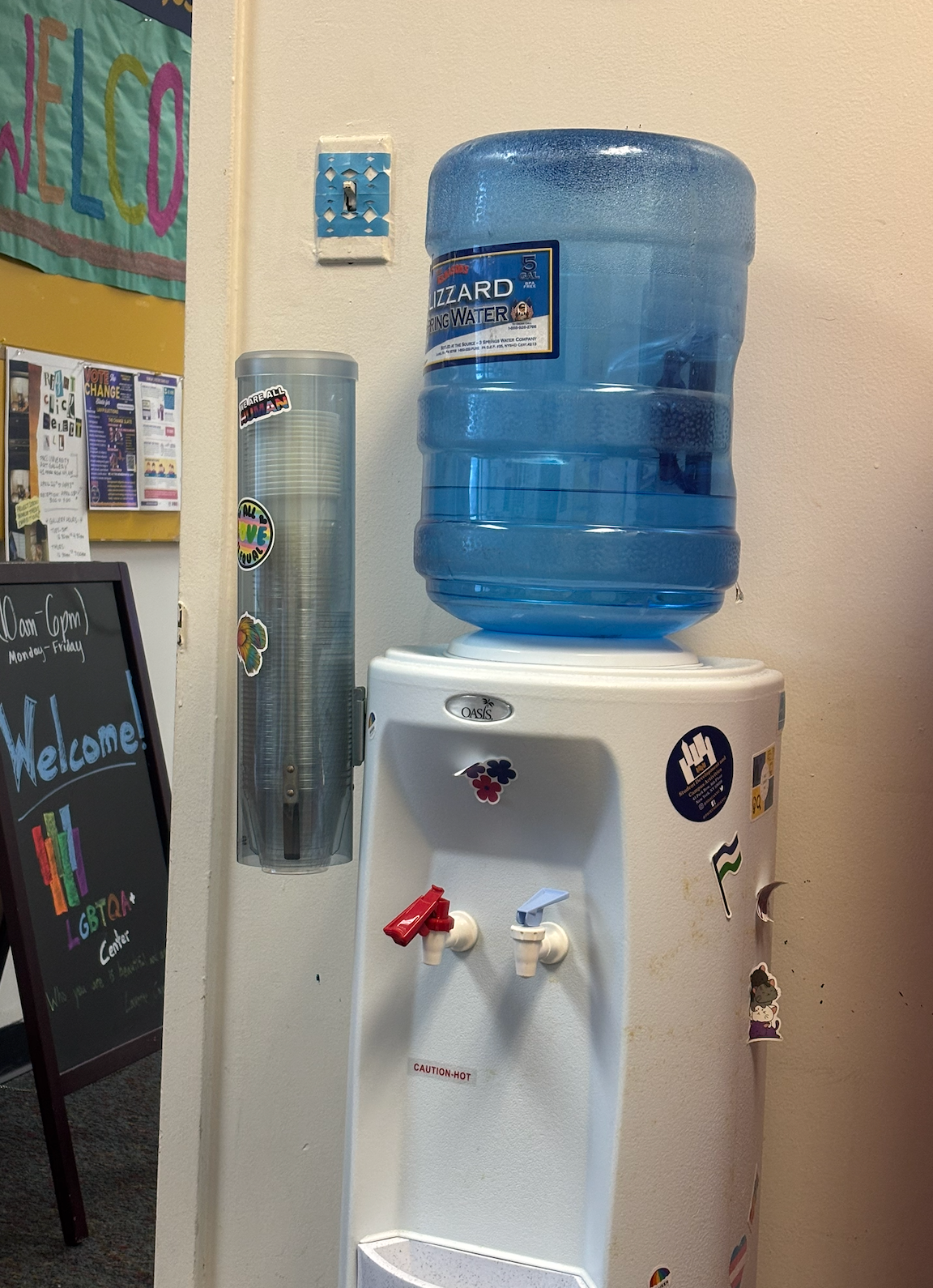
As an office worker in the daytime, there is something so absolutely complete to me about these water machines. Whether it be icy cold water, steaming hot for tea and coffee, these have clear indicators and satisfying pop-down levers. By pulling a cup down easily, you’re able to fill up, drink some, and move on. You will never be blindsided by low water levels because… It’s clear!! Accidentally spill? There’s a catcher for your liquids!
04/27/2025: DESIGN FAIL
I am not a fan of the “Classes” banner for specific classes. For example, “Content” is frequently not where professors actually organize their content, and the main titles of “Activities, Achievements, & Tools” are not very good identifiers for the dropdown options. For example, “Achievements” are where you find grades, which feels off. Activities are where you find discussion boards and assignments, which are not activities. They should just be called assignments and include discussion boards. Video should just be under content as well.

04/20/2025: WHIMSICAL MAPS
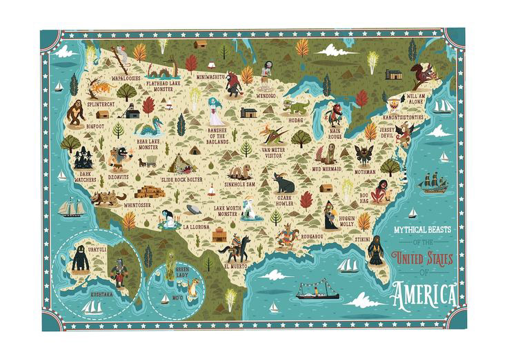
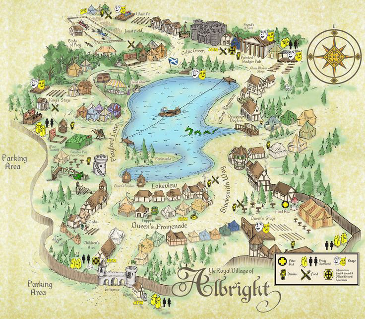
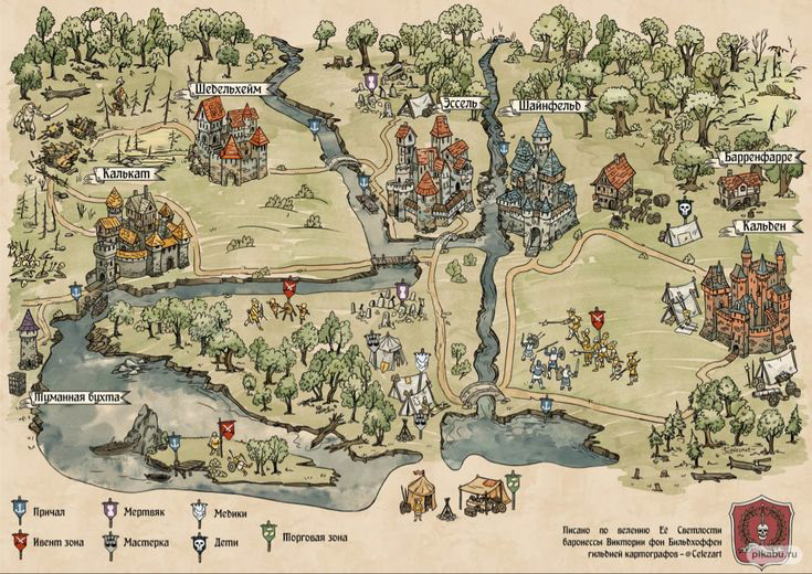
I am quite fond of strange maps that also invite a sort of navigation system that is less directional, and more of a “what you may find here” via illustrations, colors, and symbols. These are often found in video game settings, mythological cartography, and whimsical settings.
1) This is a great example of a natural, animalistic, and whimsical creature and figure-led map, with symbols for all that you may find in those areas. It has an illustrative but almost video game-style characteristic.
2) This is a smaller map of the royal village of Albright, which has detailed illustrations and drawings of neighborhoods, parks, and even patches of trees to identify different areas. It’s funny because certain proportions are a bit off, but it brings it all together.
3) In a similar style to the previous maps, this one prioritizes trees and bushels, with unproportional castles and key identifications, This one heavily reminds me of video games such as Animal Crossing and Stardew Valley.
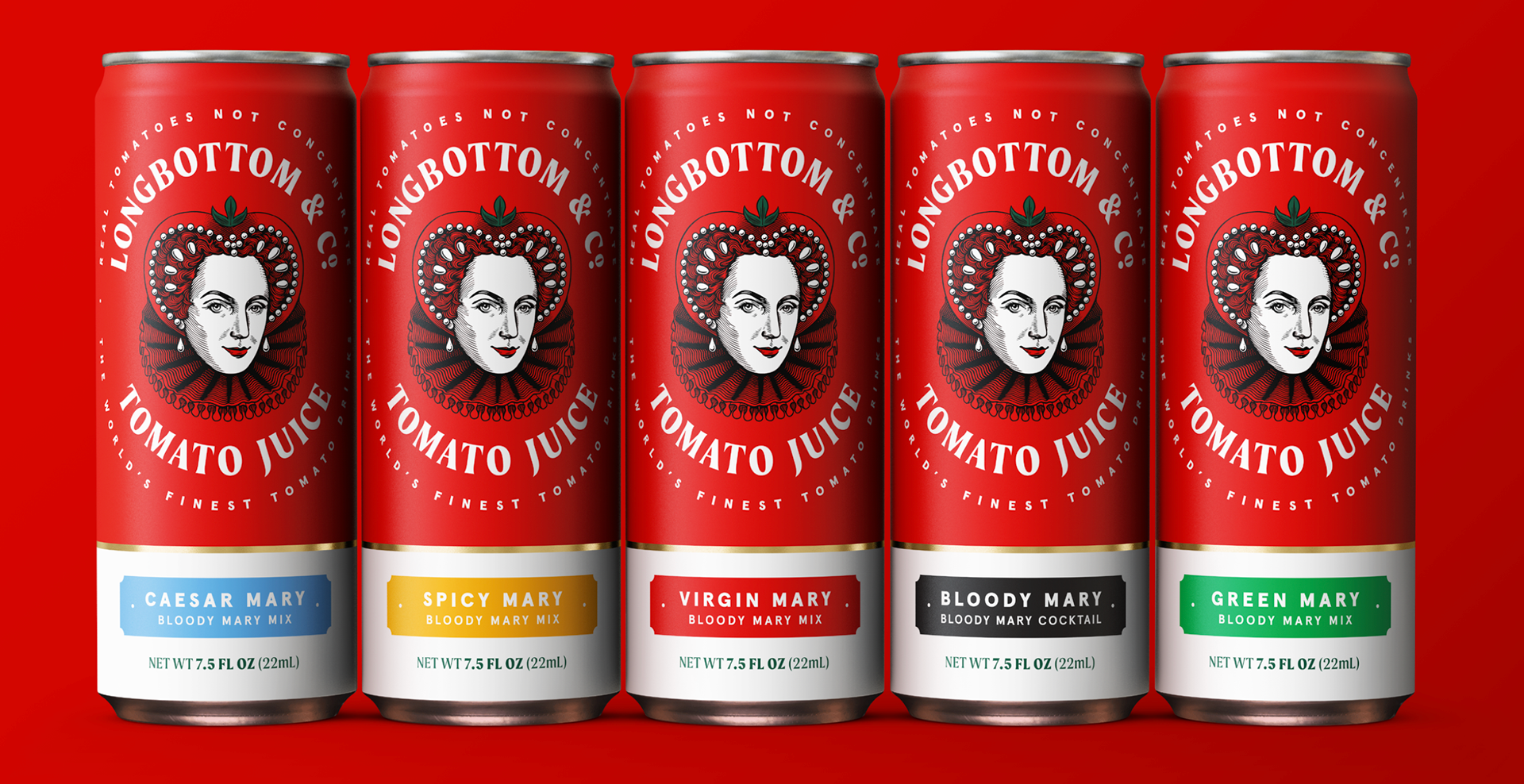
04/09/2025: ADS IN COLOR WITH ERIC & CO.
When designed by Derek & Eric, clients are met with unique, independent, and color-heavy designs with whimsical homages. The duo team, whose names are actually named Adam and Alex, a London-based firm with a spectrum of styles. Here are three projects whose color signals stuck out to me.
1) Longbottom & Co. Tomato Juice
The product redesign, with a strong primary red, using muted and playful tones of the rainbow for lower indicators of each cans flavor, this virgin Bloody Mary mix does the opposite of what I would normally want a Bloody Mary to do: remind me that it’s tomato juice. However, the Queen of Hearts illustrations with her tomato crown paired with a striking gold lining and green details strike my eyes in a nauseating but strange way, not something you see every day.
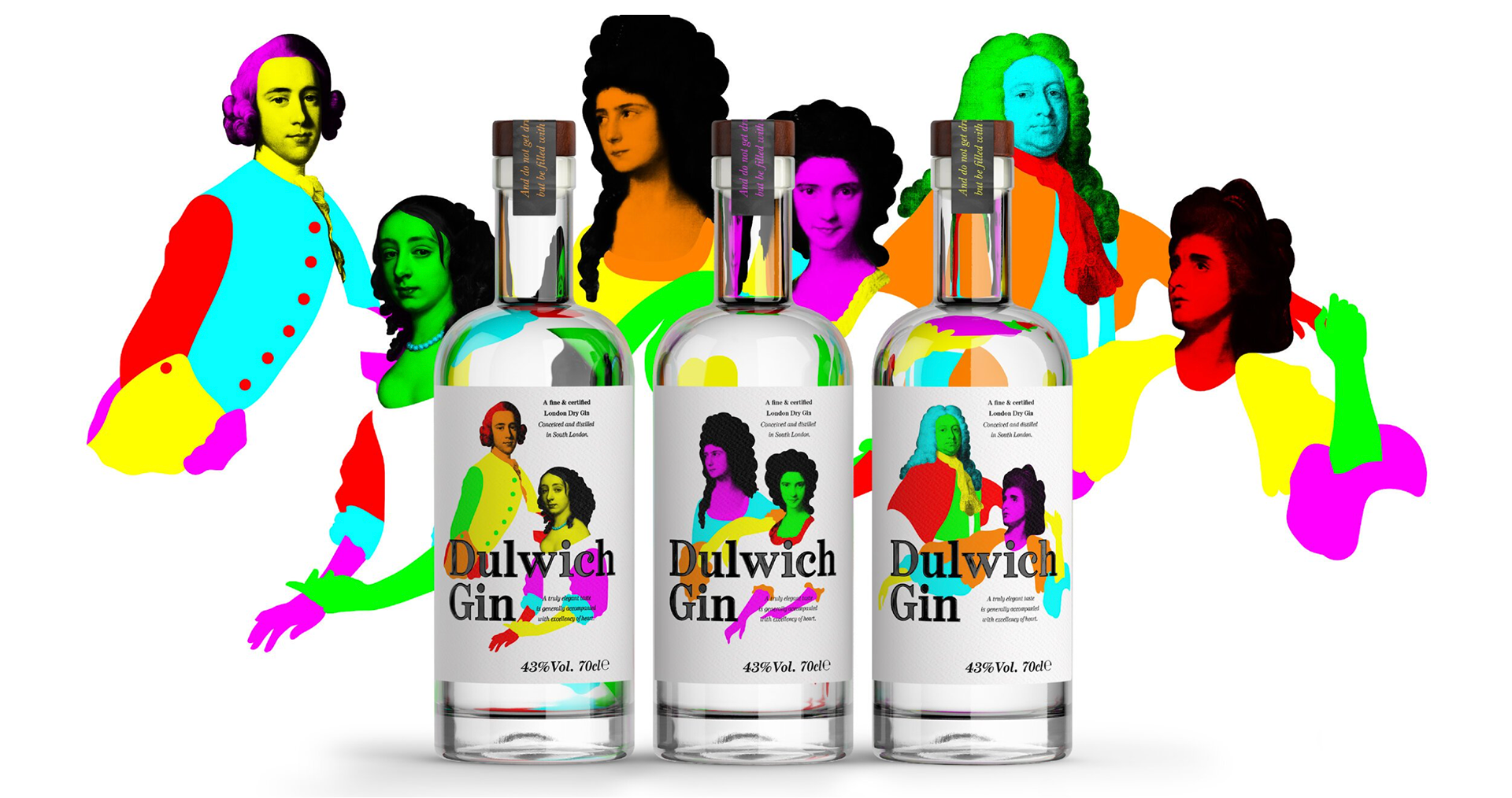
2) Dulwhich Gin
With hyper-neon historical figures and a smooth clean white label, this bottle is sure to catch your eye in a sea of gins in your local liquor store. What made me giggle, was the fact the colors were at their utmost neon, while the black label lays low at a muted, comfortably readable black tone. They clearly aren’t afraid of disrupting the sea of understated gin designs with a rainbow of smooth anatomical blobs.
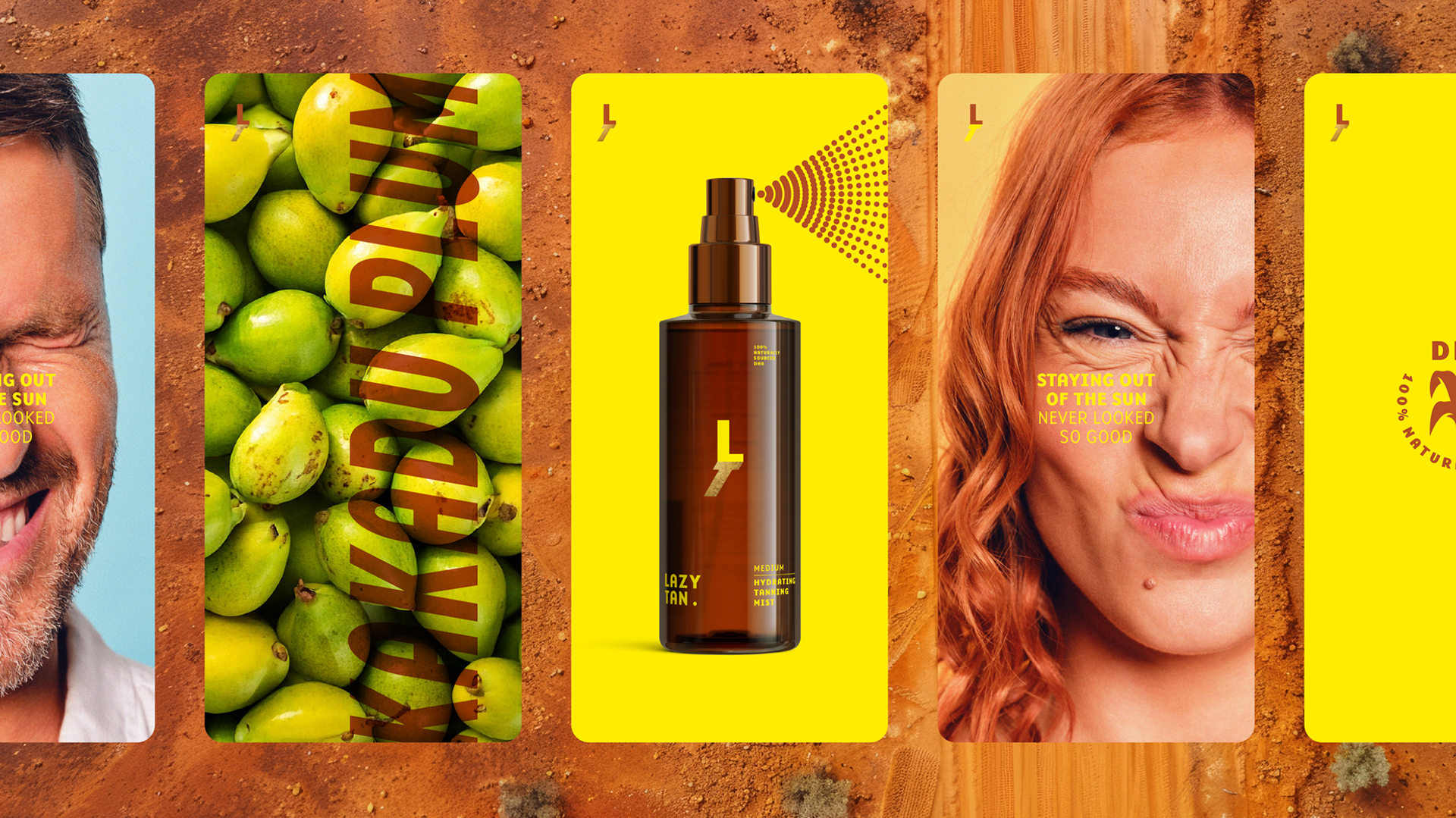
3) Lazy Tan
Every color I see in this brand kit just screams “I’ve been at the beach for 6 hours, I am a little dizzy and sunburnt, but boy am I going to sleep well tonight”. With tones from warm orange sands, sun-kissed skin, and brown tones working well with olive greens. The color scheme is warm, and comforting, and feels like I can smell the vanilla sunscreen through the screen!
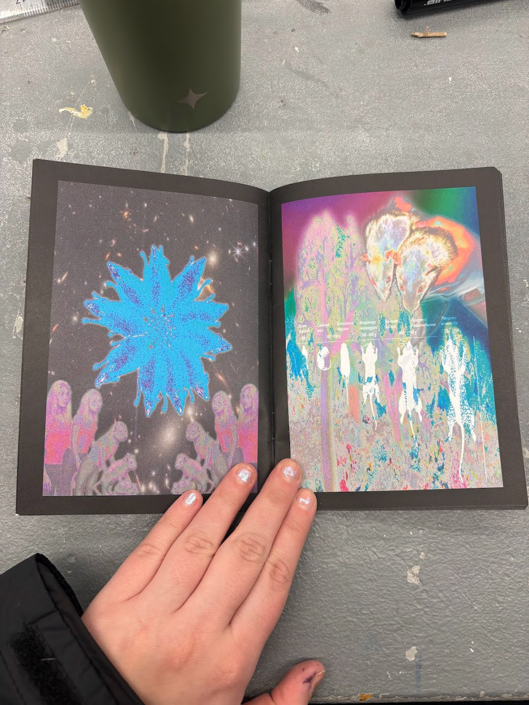
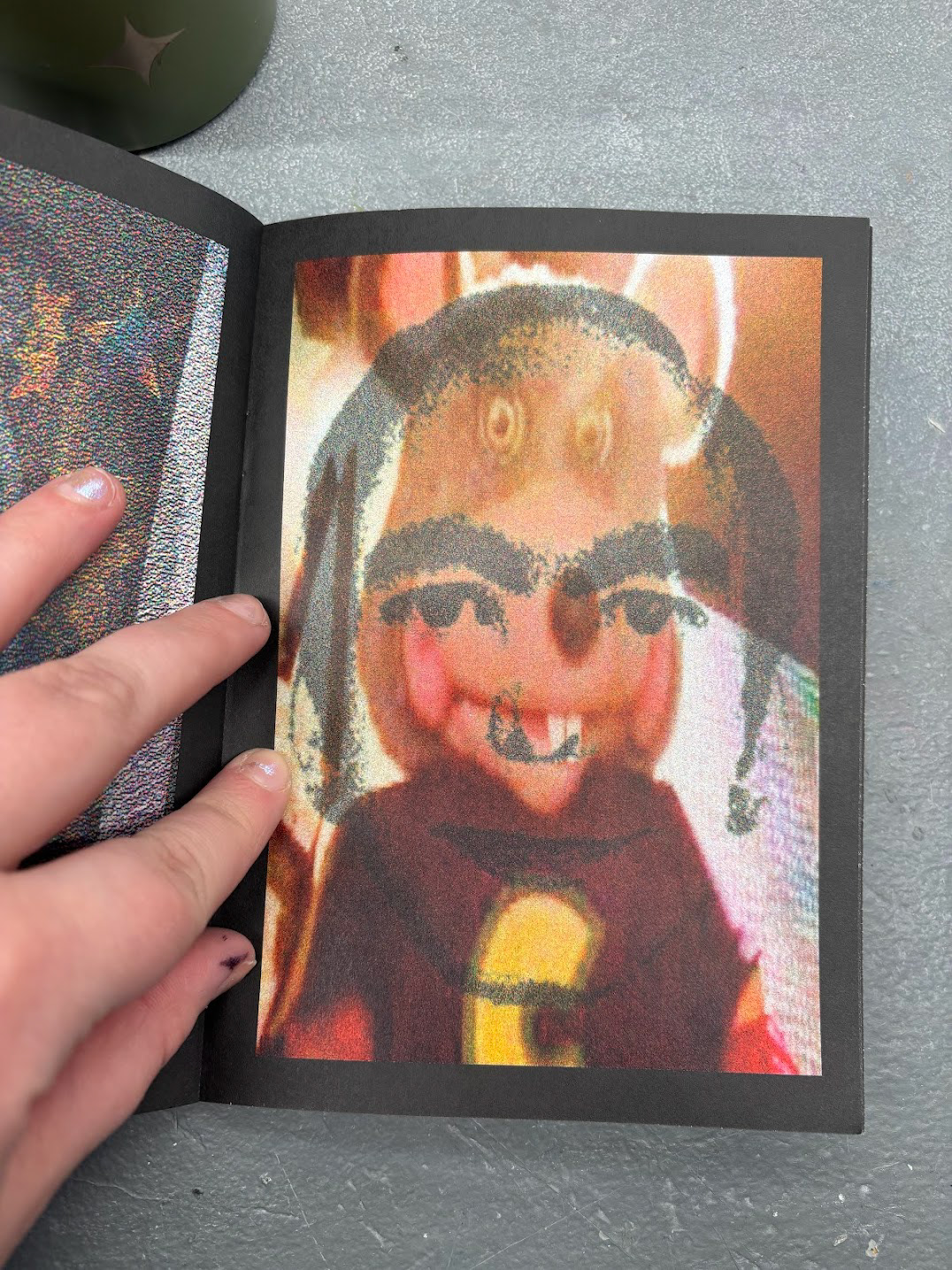
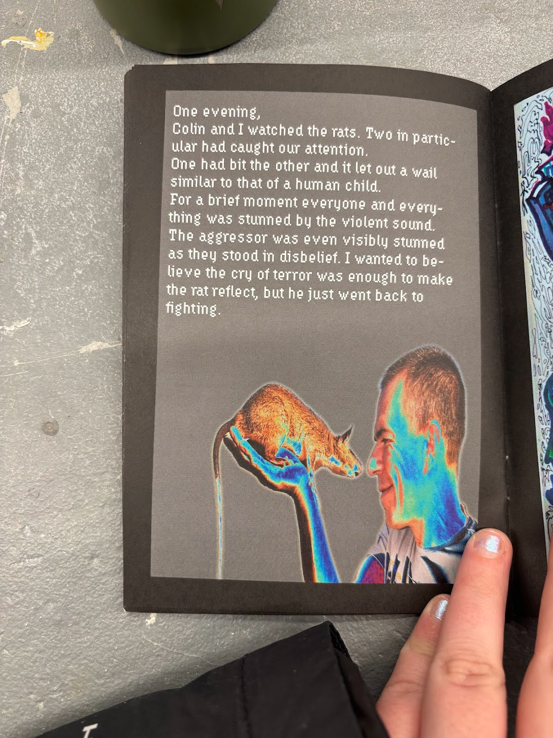
02/19/2025: GLOOBERUS ZINE WITH @DOSSA.BOI
In "Glooberus" by Dossa Boi, also known as Warren Carrington, a Junior at Pace University created an electrifying mini zine about NYC rats, color composition, and his identity in America. With bright neons battling for your attention, and sneaky hints of pop culture references sewn into over-the-top compositions, this zine is one to be re-read over and over again attempting to understand it further.